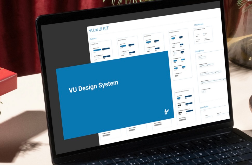
VU Design System

Role

Lead UX Designer

The Team

Communication & Marketing, Product Owner, and Developers.

Skills

Stakeholder Management, Information Architecture, UX Principles, Cross-team Communication

VU Design System Preview

The lack of a unified design system at VU Amsterdam led to several key challenges. The inconsistent user interface across different applications caused confusion and hindered productivity. This patchwork of designs made it difficult for employees to efficiently navigate the digital landscape. The primary goal was to create a unified digital environment that enhances usability and productivity.

The Solution

The VU Amsterdam design system ensures a consistent user experience, streamlines workflows, and enhances productivity by providing a centralized hub for all essential tools and information.

By integrating self-service tools and information into a unified dashboard, employees at VU Amsterdam found a personalized hub for daily tasks. This eliminated the need to use multiple platforms, streamlining workflows and improving efficiency. The design system includes a UI kit, brand guidelines, and a component library. This benefits designers, developers, and, most importantly, the end-users. By creating a design system with accessible components, we ensured the design of an accessible website for different end-users.

UI Kit

Offers a comprehensive library of reusable components and style guidelines.

Brand Guidelines

Offers a clear framework, ensuring consistent brand representation across all platforms.

Component Library

Offers a centralized repository of pre-built, tested, and easily implemented components.

Templates Library

The Templates Library offers pre-designed page layouts and components, accelerating the design process.

Design Process

1

Define

Researched the different components across the VU landscape

Defined the different needed atoms

Discussed technical implementation and requirements

Define phase
2

Design

Created a design system based on atomic design principles

Built a UI kit with Figma, ensuring consistency and ease of use

Produced usable components

Design phase
3

Deliver

Held meetings with front-end developers and product owners

Helped create and implement design tokens

Ensured design system components were implemented correctly

Deliver phase

Impact & Results

Improved Consistency

The design system ensured a uniform look and feel across all VU platforms, enhancing brand recognition.

Enhanced Efficiency

Reduced the time spent searching for information, allowing employees to focus on their core responsibilities.

Better Collaboration

The design system fostered a shared understanding and language among designers, developers, and stakeholders.

Scalability

The modular design of the system allows for easy integration of new features and services.

Accessibility

The design system ensured that digital resources were accessible to all employees, regardless of disability.

Cost Savings

Reduces costs by cutting design and development time, minimizing errors, and promoting component reuse.